Introduction to CSS
Motivation
Separation of concerns is a powerful technique for managing complexity. Here are three things that are good to separate:
- Content. What is your data and how is structured? Think canvases, headings, menus, footers, articles, sections, paragraphs, lists, tables, videos, interactive controls (buttons, sliders, text input fields).
- Presentation. How does your data appear? Think sizes, fonts, spacing, aural cues, colors, borders, margins, shadows, positioning (relative, absolute, fixed, grid, flex, float, 2-D and 3-D transforms), transitions and animations.
- Interactivity What events occur and what should be done in response? (This is a good question for now, but keep and open mind about what interactivity really is, or should be, or could be.)
In web applications:
HTML
Content
CSS
Presentation
JavaScript
Interactivity
To learn what CSS is and where it came from, you can browse the introductory page about CSS at MDN.
Demos First!
Start by seeing what you can do with CSS. This collection of 20 examples is pretty good. Try out a few before moving on.
The old CSS Zen Garden is still around. Take a look. It’s worth exploring as it shows the power of separation of concerns. All of these sites have exactly the same HTML, but it’s hard to notice at first!
Learning CSS
To learn anything, you can browse tutorials and you can just start doing a project. Generally, to a little of both, but don’t just do tutorials.
There are quite a few out there. HTML Dog has three good tutorials—one for beginners, one that is intermediate, and one that is advanced. You should do all three. They don’t cover all of CSS by any means (surprisingly, they completely ignore Flex and Grid layouts!), but they will get you started.
We will browse some of the examples in the HTML Dog Tutorials. The examples have a live editor and runner so we can explore all the different things that CSS can do directly within the HTML Dog site.
You can’t go wrong with this complete 11-hour tutorial, it’s by Dave Gray so it’s good:
Also excellent is the MDN Guide to Learning CSS. It takes you through several learning modules titled First Steps, Building Blocks, Styling Text, and Layout.
When learning, you need more that just tutorials. You’ll want reference information too. Good places to go are:
- MDN’s CSS Reference.
- The CSS home page maintained by the W3C.
- cssreference.io which is great
As you get good at CSS, one of your go-to sites will be CSS Tricks. It has tutorials and reference information.
Structure of a Stylesheet
Here is a simple example of a CSS stylesheet:
body {
  text-align: center;
  padding: 30px;
}

h1 {
  color: pink;
  text-shadow: 1px 1px 2px black;
  animation: welcome 5s forwards;
}

#card {
  border: 10px blue dotted;
  background-color: #ffdce6;
  display: flex;
  flex-direction: column;
  justify-content: center;
  align-items: center;
  min-height: 300px;
  padding: 20px 50px;
}

#start {
  font-size: 2rem;
}

.ask {
  margin-bottom: 10px;
  font-size: 1.5rem;
}

.correct,
.incorrect {
  transition: font-size 3s, opacity 2s;
  line-height: 1.5em;
  cursor: pointer;
}

@keyframes welcome {
  0% {
    background-color: white;
    padding: 0;
    letter-spacing: 0;
  }
  90% {
    letter-spacing: 0.7em;
  }
  100% {
    background-color: black;
    padding: 20px 10px;
    letter-spacing: 0.5em;
  }
}
Statements
A style sheet is made up of a sequence of statements. Each statement is either a ruleset or an at-rule.
Rulesets
A ruleset (sometimes called just a rule) is a statement that tells the user agent (UA) how to render an element or elements.
You can condense rulesets as follows:
| Instead of... | You can write... |
|---|---|
h1 {font-weight: bold}
h2 {font-weight: bold}
h3 {font-weight: bold}
|
h1, h2, h3 {font-weight: bold}
|
h1 {color: green}
h1 {text-align: center}
|
h1 {
  color: green;
  text-align: center;
}
|
At-rules
An at-rule is kind of like an instruction to the CSS parser. The common at-rules are:
@charset,
@import,
@media,
@page,
@font-face,
@namespace,
@keyframes,
@layer,
@property,
@container,
@color-profile,
@counter-style,
@scope,
@supports,
@view-transition, and
@counter-style.
We’ll see some of these later.
Properties
There are hundreds of properties. In the early days of CSS1 there were just a few. CSS2 brought the count up to just over 100; CSS3 added hundreds more.
You might be interested in the W3C’s description of all the properties that were officially part of CSS back in 2010. Those are the most stable and widely supported.
Here is a sampling of most of the CSS3 properties:
| Animations | animation animation-delay animation-direction animation-duration animation-fill-mode animation-iteration-count animation-name animation-play-state animation-timing-function |
|---|---|
| Backgrounds and Borders | background background-attachment background-clip background-colo background-image background-origin background-position background-repeat background-size border border-bottom border-bottom-color border-bottom-left-radius border-bottom-right-radius border-bottom-style border-bottom-width border-color border-image border-image-outset border-image-repeat border-image-slice border-image-source border-image-width border-left border-left-color border-left-style border-left-width border-radius border-right border-right-color border-right-style border-right-width border-style border-top border-top-color border-top-left-radius border-top-right-radius border-top-style border-top-width border-width box-shadow |
| UI (Level 3) | box-sizing caret-color cursor nav-down nav-left nav-right nav-up outline outline-color outline-offset outline-style outline-width resize text-overflow |
| UI (Level 4) | appearance caret caret-animation caret-shape user-select |
| Box Alignment | align-content align-items align-self justify-content justify-items justify-self |
| Cascading and Inheritance | all |
| Color | color color-adjust opacity |
| Custom | --* |
| Display | box-suppress display |
| Exclusions | wrap-flow wrap-through |
| Flexible Box Layout | align-content align-items align-self flex flex-basis flex-direction flex-flow flex-grow flex-shrink flex-wrap justify-content order |
| Fonts | font font-family font-feature-settings font-kerning font-language-override font-size font-size-adjust font-stretch font-style font-synthesis font-variant font-variant-alternates font-variant-caps font-variant-east-asian font-variant-ligatures font-variant-numeric font-variant-position font-weight |
| Fragmentation | box-decoration-break break-after break-before break-inside orphans widows |
| Generated Content | bookmark-label bookmark-level bookmark-state content quotes string-set |
| Generated Content for Paged Media | bookmark-label bookmark-level bookmark-state footnote-display footnote-policy running string-set |
| Grid Layout | grid grid-area grid-auto-columns grid-auto-flow grid-auto-rows grid-column grid-column-end grid-column-gap grid-column-start grid-gap grid-row grid-row-end grid-row-gap grid-row-start grid-template grid-template-areas grid-template-columns grid-template-rows |
| Image Values and Replaced Content | image-orientation image-rendering image-resolution object-fit object-position |
| Inline Layout | alignment-baseline baseline-shift dominant-baseline initial-letter initial-letter-align initial-letter-wrap vertical-align |
| Line Grid | box-snap line-grid line-snap |
| Lists and Counters | counter-increment counter-reset counter-set list-style list-style-image list-style-position list-style-type marker-side |
| Masking | clip clip-path clip-rule mask mask-border mask-border-mode mask-border-outset mask-border-repeat mask-border-slice mask-border-source mask-border-width mask-clip mask-composite mask-image mask-mode mask-origin mask-position mask-repeat mask-size mask-type |
| Multicolumn Layout | break-after break-before break-inside column-count column-fill column-gap column-rule column-rule-color column-rule-style column-rule-width column-span column-width columns |
| Overflow | continue max-lines overflow overflow-x overflow-y |
| Page Floats | clear float float-defer float-offset float-reference |
| Paged Media | page size |
| Positioned Layout | bottom left offset-after offset-before offset-end offset-start position right top z-index |
| Presentation Levels | presentation-level |
| Regions | break-after break-before break-inside flow-from flow-into region-fragment |
| Round Display | border-boundary polar-anchor polar-angle polar-distance polar-origin shape-inside |
| Ruby Layout | display ruby-align ruby-merge ruby-position |
| Scroll Snap | scroll-padding scroll-padding-block scroll-padding-block-end scroll-padding-block-start scroll-padding-bottom scroll-padding-inline scroll-padding-inline-end scroll-padding-inline-start scroll-padding-left scroll-padding-right scroll-padding-top scroll-snap-align scroll-snap-margin scroll-snap-margin-block scroll-snap-margin-block-end scroll-snap-margin-block-start scroll-snap-margin-bottom scroll-snap-margin-inline scroll-snap-margin-inline-end scroll-snap-margin-inline-start scroll-snap-margin-left scroll-snap-margin-right scroll-snap-margin-top scroll-snap-stop scroll-snap-type |
| Shapes | shape-image-thresholdshape-marginshape-outside |
| Speech | cue cue-after cue-before pause pause-after pause-before rest rest-after rest-before speak speak-as voice-balance voice-duration voice-family voice-pitch voice-range voice-rate voice-stress voice-volume |
| Table | border-collapse border-spacing caption-side empty-cells table-layout |
| Template Layout | chains flow grid grid-template grid-template-areas grid-template-columns grid-template-rows |
| Text Decoration | text-decoration text-decoration-color text-decoration-line text-decoration-skip text-decoration-style text-emphasis text-emphasis-color text-emphasis-position text-emphasis-style text-shadow text-underline-position |
| Text (Level 3) | hanging-punctuation hyphens letter-spacing line-break overflow-wrap tab-size text-align text-align-all text-align-last text-indent text-justify text-transform white-space word-break word-spacing word-wrap |
| Text (Level 4) | hyphenate-character hyphenate-limit-chars hyphenate-limit-last hyphenate-limit-lines hyphenate-limit-zone text-space-collapse text-space-trim text-spacing text-wrap white-space wrap-after wrap-before wrap-inside |
| Transforms | backface-visibility perspective perspective-origin transform transform-box transform-origin transform-style |
| Transitions | transition transition-delay transition-duration transition-property transition-timing-function |
| Will Change | will-change |
| Writing Modes | direction glyph-orientation-vertical text-combine-upright text-orientation unicode-bidi writing-mode |
| Basic Box Model | clear display float height margin margin-bottom margin-left margin-right margin-top marquee-direction marquee-loop marquee-speed marquee-style max-height max-width min-height min-width overflow overflow-style overflow-x overflow-y padding padding-bottom padding-left padding-right padding-top rotation rotation-point visibility width |
| CSSOM View | scroll-behavior |
| Compositing and Blending | background-blend-mode isolation mix-blend-mode |
| Filter Effects | color-interpolation-filters filter flood-color flood-opacity lighting-color |
| Motion Path | motion motion-offset motion-path motion-rotation offset offset-anchor offset-distance offset-path offset-position offset-rotation |
| SVG Markers | marker marker-end marker-knockout-left marker-knockout-right marker-mid marker-pattern marker-segment marker-start |
| SVG Strokes | stroke stroke-alignment stroke-dashadjust stroke-dasharray stroke-dashcorner stroke-dashoffset stroke-linecap stroke-linejoin stroke-miterlimit stroke-opacity stroke-width |
This set was taken from this list of all properties at the W3C site.
You can find other property references at HTML Dog, MDN, and cssreference.io. They all vary in completeness.
Property Values
Some properties have values that are special tokens, specific to that property (or a handful of properties), for example:
font-family: serif
font-variant: small-caps
text-align: center
text-decoration: underline
margin-left: auto
border-left-width: medium
list-style-position: inside
list-style-type: square
white-space: pre
cursor: pointer
overflow: scroll
visibility: hidden
clear: both
display: table-row
position: absolute
The values inherit, initial, and unset apply everywhere. Some values are keywords (like pointer and scroll above), and some are fancy forms like linear and radial gradients. Sometimes the property value comes from a specific type. Here are some of the types in CSS:
| Type | Notes |
|---|---|
| integer | Just an integer |
| number | A number with an optional dot (not exponential part) |
| percentage | A number followed by a % character
|
| string | Double quoted or single quoted (use \A for newline)
|
| url | A url wrapped in url( and )
|
| length | em, ex, ch, rem vw, vh, vmin, vmax cm, mm, Q, in, pt, pc, px |
| color | Defined here |
| image | Defined here |
| position | Defined here |
| angle | deg, rad, grad, turn |
| duration | s, ms |
| frequency | Hz, kHz |
| resolution | dpi, dpcm, dppx |
And, you guessed it, you should see the HTML Dog CSS Value Reference. Also note the Official CSS Document from the W3C listing all values and units.
To find which values go with which properties, you should check the official docs for that module. There is also a convenient table of the mappings way back in the year 2010, so not all mappings are contained, but the most common ones are.
Speaking of color, here’s something you should watch if you think that red, yellow, and blue are primary colors (SPOILER: THEY ARE NOT):
As with any technology, there are tons of ways to get things wrong with CSS values. Here are some very common mistakes:
p { font-vendor: any }/* Invalid prop.: font-vendor */h1 { font-style: 12pt }/* Invalid value for prop: 12pt */h1 { rotation: 70minutes }/* 70minutes is not a valid value */img { float: left here }/* "here" is not a value of "float" */img { background: "red" }/* keywords cannot be quoted in CSS2 */img { border-width: 3 }/* a unit must be specified for length values */h3, h4 & h5 {color: red }/* & is an invalid token- WHOLE LINE must be ignored */
Binding Properties to Elements
The job of the user agent is to determine which styles to apply to each element. Easier said than done, right? There are four things to know: selectors, inheritance, cascade, specificity:
- There are many ways to directly select the elements to which the properties will apply. This is done via selectors.
- We can’t enumerate each of the hundreds of properties on each element; most of the time a property will need to be inherited from somewhere.
- You might have multiple stylesheets, with conflicting settings; the style sheets cascade.
- An element may be targeted in different (conflicting) rules; there has to be a way to measure each rule’s specificity so we know which one is applicable.
You can find overviews in the MDN’s Learning CSS Guide on selectors and for how all three of Cascade, Specificity, and Inheritance all work together. You can go deeper into Specificity, Inheritance, and Cascade.
Selectors
Here are some places to look with both reference information and lots of examples:
- The MDN CSS Learning Guide has an introductory guide (with four followup pages) and a selectors reference.
- The official W3C Recommendation, with the selector definitions and syntax.
- HTML Dog’s CSS Selectors Reference.
- CSS Tricks has a good article on how selectors work.
- A little summary at W3 Schools.
Kyle has a good video:
You should train on this stuff! Play CSS Diner.
Inheritance
Oversimplifiying, inheritance has to do with nesting:
<html>
  <head>
    <title>Another Example</title>
    <style>
      body {color: green; background: white;}
      h1 {color: navy}
    </style>
  </head>
  <body>
    <h1>Test</h1>
    <p>Here is an <strong>example</strong> of</p>
    <ul>
      <li>Style sheets</li>
      <li>Inheritance of properties</li>
      <li>Overriding</li>
    </ul>
  </body>
</html>
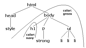
There’s more, so check out relevant reference material.
inherit which means the corresponding element gets same value for that property as its parent. This seems to be default behavior. Look up and describe when you would ever want to do this.
The Cascade
In a large web app you’ll find styles that are defined in the user agent’s own stylesheet, author style sheets written by the app developer, and (in some cases) stylesheets applied by the app user. The Cascade defines the precedence of all these things.
Specificity
Specificity determines which styles to use when an element is targeted in multiple rules. Somewhat oversimplifying, it’s computed by assigning a tuple (X, Y, Z) to each rule, where:
- X = the number of id (
#) selectors - Y = the number of class (
.) selectors, attribute ([]) selectors, and pseudo-classes (:) - Z = the number of type selectors and pseudo-elements (
::)
and sorting on these tuples, though inline styles (see below) are more specific than any rule from a stylesheet and then the dreaded !important is used even over that.
After reading some tutorials and docs and practicing, you can refer to because the examples are so good.
Connecting a Stylesheet to a Document
Quite a few ways:
- In an HTML
<link>element - In an HTML
<style>element - As a
styleattribute in any HTML element that allows it
The <link> element
You can specify the location of the stylesheet that is an external resource. This is the most common way and almost always the best. Example:
<html>
  <head>
    <title>Another Example</title>
    <link rel="stylesheet" href="plain.css" media="screen">
  </head>
  <body>
    <p>Hello</p>
  </body>
</html>
Possible values for media include: screen, tty, tv, projection, handheld, print, braille, aural, all.
The <style> element
You can add the styles directly in the head of a document. Example:
<html>
  <head>
    <title>Another Example</title>
    <style>
      body {padding: 2em; background: white;}
      p {font: 36pt serif}
    </style>
  </head>
  <body>
    <p>Hello</p>
  </body>
</html>
You probably should not be using these.
Use only in tiny web page hacks and prototypes. You should be cleanly separating your content and presentation.
Inline styles
You can put styles right on a single element. Example:
<h1 style="color:blue; text-align:right">Hello</h1>
<div style="position:absolute; z-index:1; left:20px; top:160px; width:150px">
Do not use these in plain HTML.
As you can imagine, while these are tempting, (1) they can only be used on a single element making the style impossible to share, and (2) they kind of violate the concept of separation of concerns.
HOWEVER, if you have a framework like React, bundling styles closer to elements is actually a good thing, but the approach is slightly different. There’s a lit of nuance in programming sometimes.
Box Model
Elements in a document is a rectangular box. The CSS box model describes the rectangular boxes that are generated for elements in the document tree and laid out according to the visual formatting model.
An ancient presentation:
Layouts
The box model is concerned with the margin, padding, border, and content of individual elements. Layouts are concerned with how elements are arranged on the page.
Flex
See A Complete Guide to Flexbox by CSS Tricks.
Grid
See A Complete Guide to Grid from CSS Tricks.
Position
See About the Position Property at CSS Tricks.
Float
See the Float page at CSS Tricks.
Transforms
See the Transforms page at MDN.
Animation
CSS can specify animations. This is done with the animation property and the @keyframes at-rule. For super simple animations, you can use the transition property.
I don’t have any notes yet, but Kyle has a short video where he goes over everything:
No JS
Here is a talk and demo by Ana Tudor showing off what you can do with CSS and no JavaScript:
You should also browse her collection of code pens.
Media Queries and Responsive Design
Ideally you should make applications that work correctly on all kinds of different media—PCs, handhelds, phones, tablets, speech output devices, print, etc. All differ widely in resolution, color depth, bandwidth, etc.
You can learn the basics in the Responsive Web Design section of Google’s Web Fundamentals course.
Recall Practice
Here are some questions useful for your spaced repetition learning. Many of the answers are not found on this page. Some will have popped up in lecture. Others will require you to do your own research.
- What does CSS stand for? Cascading Style Sheets
- What are the three separate concerns in web applications that are covered by HTML, CSS, and JavaScript, respectively? Content, Presentation, Behavior.
- Who’s the guy that does that 11 hour CSS video? Dave Gray
- A style sheet is made up of statements, the two kinds of which are ________________ and ________________. rulesets, at-rules
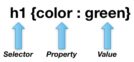
- What are the three parts of a CSS rule? selector, property, value
- What are the two main points of Echo’s color video? Cyan is not blue and magenta is’t “real”
- What is a CSS selector? An expression that target elements in a document
- What is CSS inheritance? The process by which styles are passed down from parent to child
- What is the cascade? The process by which styles are applied to elements in a document
- What is specificity? The process by which the browser determines which rule to apply when multiple rules target the same element
- What are the three ways to attach a style sheet to a document? link, style, inline
- What are the four parts of the box model? margin, border, padding, content
- What are the three main layout systems in CSS? Flex, Grid, Position
- What are the two main animation systems in CSS? animation, transition
- What is the transition property? A simple way to do super simple animations. You don’t need it; it’s just a shortcut.
- What do we mean by “No JS”? You can do a lot of cool stuff with CSS alone that one might expect would require JavaScript.
- Who’s known for doing a lot of No JS stuff? Ana Tudor
- What at-rule is used to make apps responsive? @media
Summary
We’ve covered:
- Why we need CSS
- Relationship between CSS and HTML and JavaScript
- Some demos
- Where to learn CSS
- The components of a stylesheet
- Properties, values, and types
- Technical Details
- Colors, Layouts, Animations, and more
- “No JS”